All case studies
Case study · Healthcare
Healthcare · Workshop Facilitation · Information Architecture

400 pages. No personas. A CMS already under contract.

Tanner Health engaged us for strategic UX oversight on a redesign already in motion. They'd locked in a third-party developer and a modular CMS. Over 400 pages, no defined personas, no clear IA logic. My job was to create the information architecture and user experience strategy within those constraints — and to get a team that had never done UX before to start thinking about users.

400→200 Pages consolidated
3 Personas defined
01 — The situation

Tanner Health engaged us for strategic UX oversight on their website redesign. They had already contracted a third-party development service providing a modular, templated CMS — so we needed to create the information architecture and build out page layouts based on whatever modules were available.

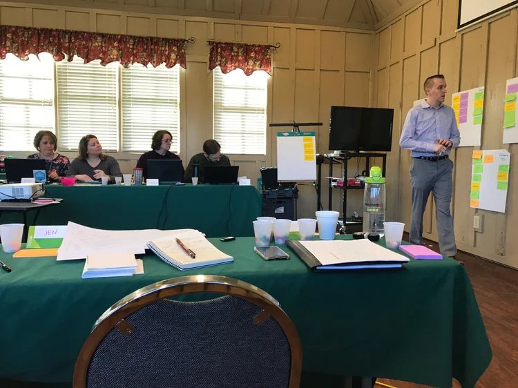
The site had over 400 pages of content with no clear logic to how they were arranged. Tanner had never gone through a formal UX process before, so education was as much a part of the engagement as the deliverables. I traveled on-site multiple times, facilitating interactive workshops with their creative, marketing, and clinical teams — keeping the project moving while consistently reinforcing user perspective as a priority.

Four problems to solve: streamline a hard-to-navigate IA, consolidate content around a clear content strategy, define unknown personas and user needs, and turn available CMS modules into a user-centered experience.
Client
Tanner Health System — Georgia-based regional health system
My role
UX strategy, information architecture, workshop facilitation, persona development, tree testing, card sorting
Constraint
Pre-selected modular CMS — design had to work within available templates
Industry
Healthcare · Regional health system
Deliverables
Attribute mapping · Personas · Stakeholder interviews · Focus groups · Tree testing · Card sorting · Sitemap · IA · Module system
02 — The process
01
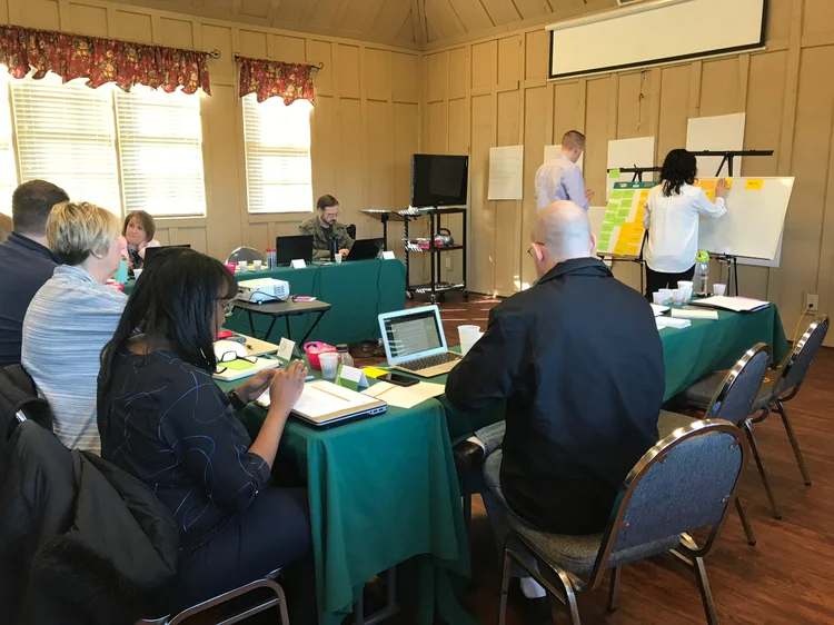
In-person workshops — attribute mapping, persona definition, and wireframes

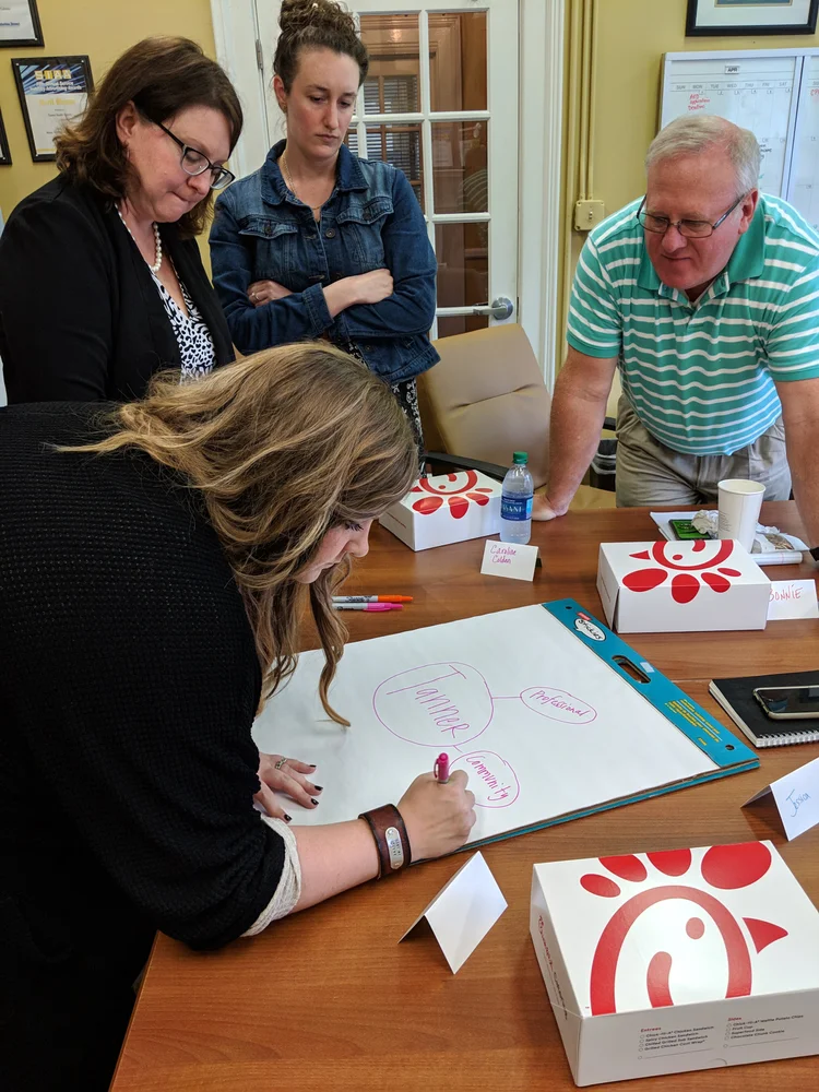
Attribute mapping. I kicked off the on-site work by having the client call out what differentiates Tanner against competitors — for both the website and the overall health system. This surfaced what the site needed to communicate and gave us a head start on IA and content strategy before speaking to any users.

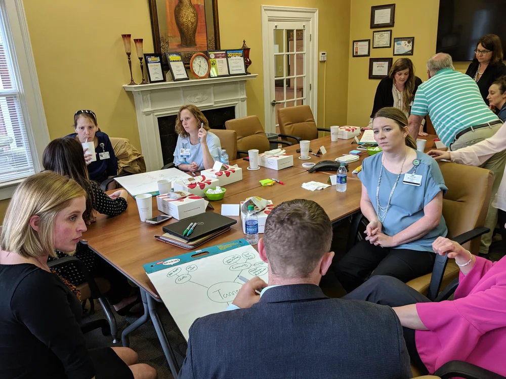
Persona workshop. Tanner had never gone through this process. I ran a workshop with internal stakeholders and the marketing team to discuss and rank the types of users coming to the site. That gave me the client's perspective as a baseline — a necessary starting point before talking to real users.

In-person wireframes. The client wanted to be an active part of the process, so we held an in-person wireframing session. The wireframes were directional, not final — they changed significantly after user feedback. But the session was productive in aligning the team around direction and giving them something tangible to react to.

Attribute mapping · Persona workshop · In-person wireframes · Stakeholder alignment
Tanner Health in-person workshop facilitation
Workshop facilitation — aligning stakeholders on user priorities
Tanner Health full team workshop session
Full team session — marketing, clinical, and creative stakeholders
Tanner Health focus group — persona ideation
Persona ideation — attribute mapping exercise in progress
Tanner Health focus group — content priorities
Content priorities workshop — identifying what users need most
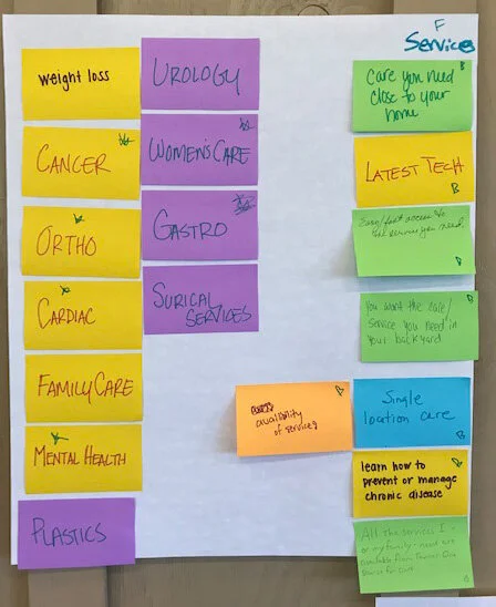
Tanner Health workshop — card sort with sticky notes
Card sort — participants organizing Tanner's service categories by user priority
02
Stakeholder interviews, focus groups, and persona development

With the workshops complete, I moved to real users. Phone interviews were the lowest-barrier entry point — I asked questions like "Think about the last time you used a medical-focused website. What did you go there for?" That started surfacing user motivations and use cases before bringing anyone into a room.

I ran two on-site focus groups. The first was with community members — the primary user of the site. The finding was consistent: the community viewed Tanner positively, but had a hard time finding what they needed. Phone numbers, appointment scheduling, department information — all of it was buried and needed to surface higher. The second focus group was with Tanner department heads, which gave me a clearer picture of how the health system was arranged internally and what their departments needed the site to do.

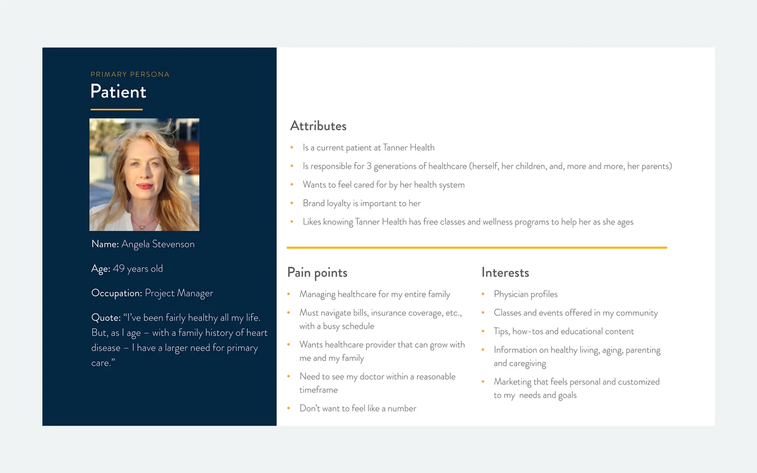
All of that shaped three personas: Patient (primary), Clinician, and Prospective Employee. The patient was determined to be primary — managing healthcare for herself and, increasingly, her family.

Phone interviews · Focus groups · 3 personas · Patient primary
Tanner Health primary persona — Patient
Primary persona — Patient (managing healthcare for 3 generations)
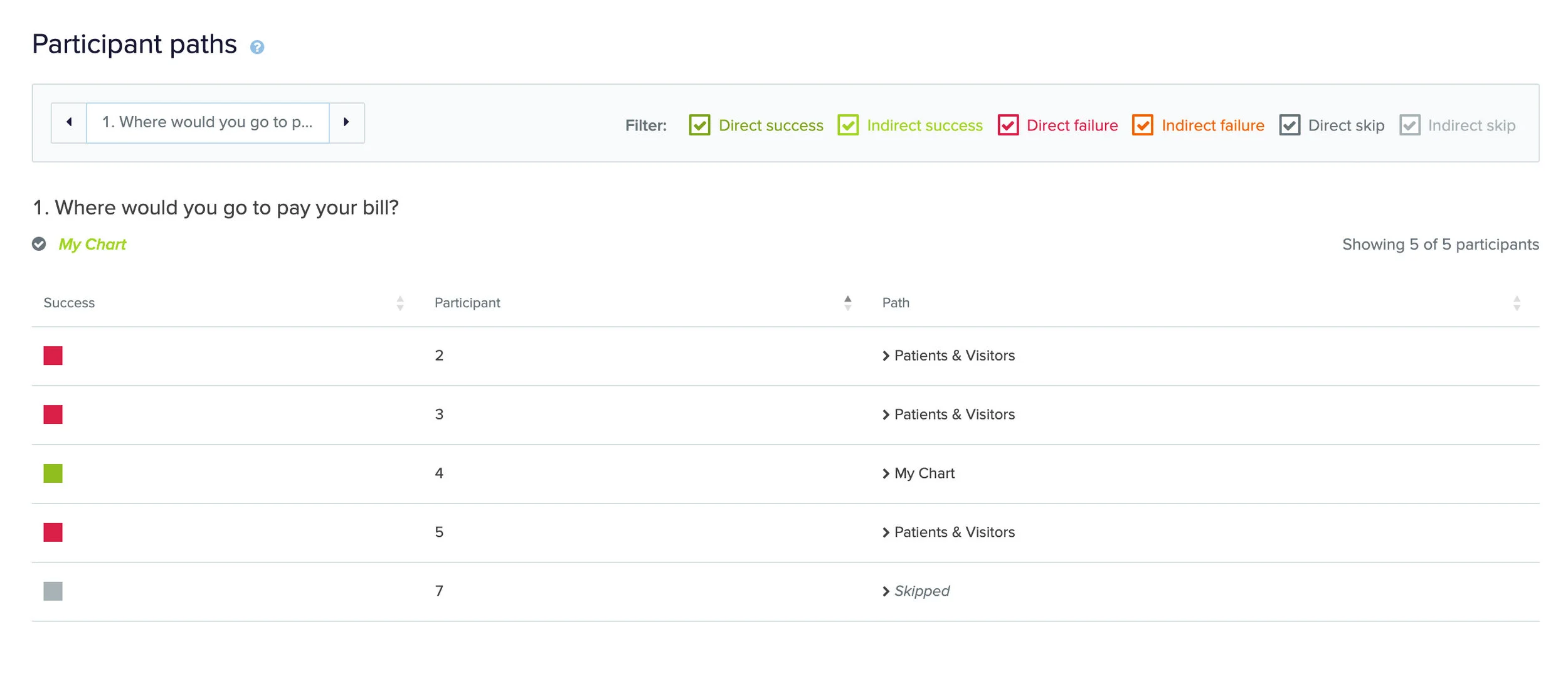
Tanner Health tree testing — participant paths
Tree testing results — participant paths showing navigation success and failure
03
Tree testing, card sorting, sitemap, and module system

Tree testing and card sorting. To understand how users navigated the existing structure, I ran a tree testing exercise — watching what paths users took to find specific content. Then a separate card sorting exercise with a different participant group. Both fed directly into the new sitemap.

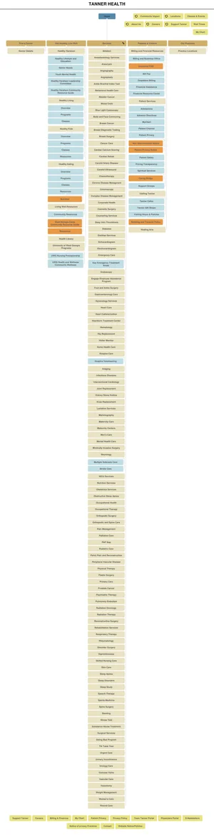
Sitemap. The previous site had over 400 pages with no clear logic to their arrangement. Using everything from the tree test, card sort, and all prior user sessions, I mapped a new structure. The site ended up around 200 pages — more streamlined, and built around what users were actually trying to do.

Information architecture. With the sitemap complete, I worked with a content strategist to define what information needed to appear on each page. The research was clear on what had been missing: phone numbers, parking, amenities, and community-focused content. Those became non-negotiables. Since Tanner is a local, community health system, that community identity needed to come through in the content.

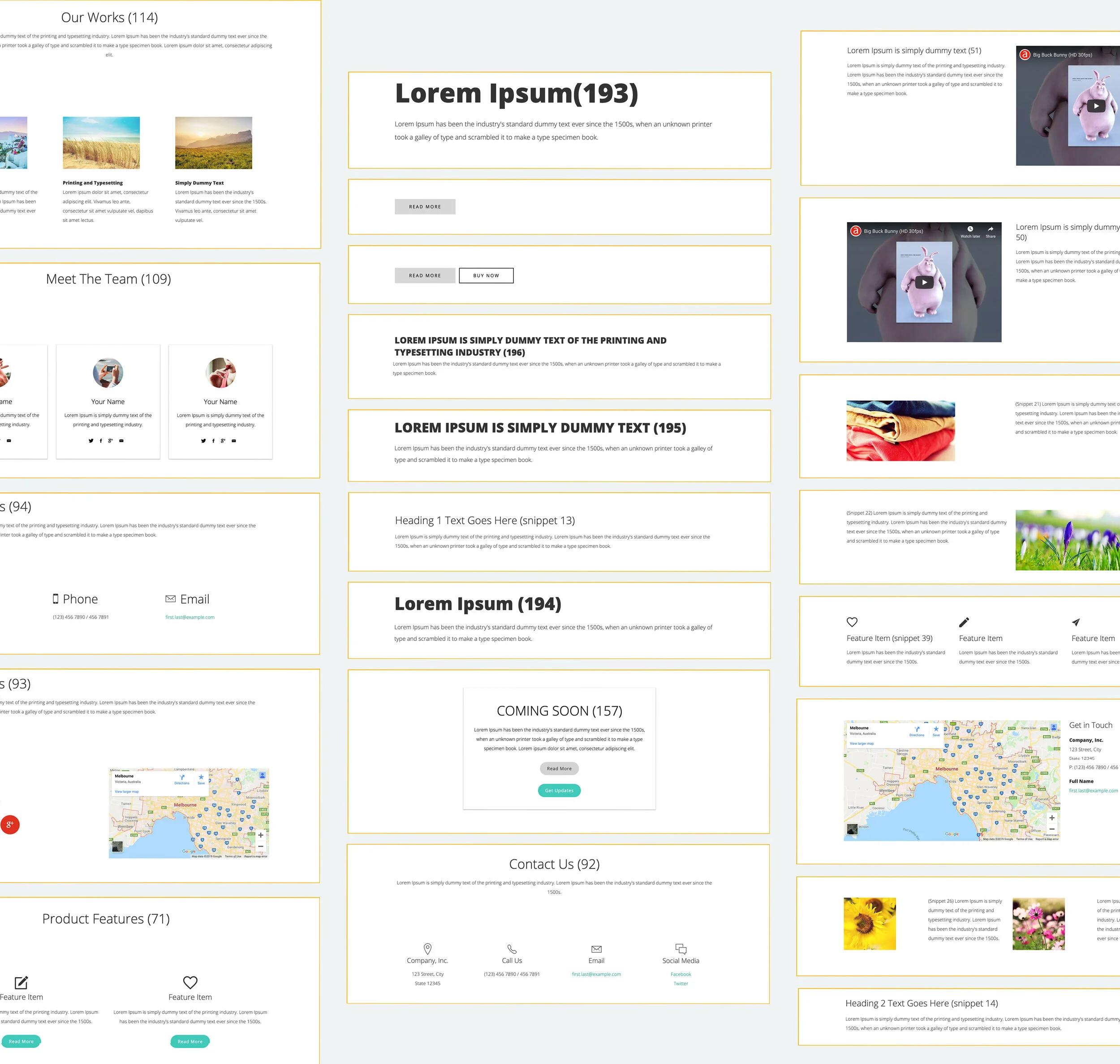
Module system. The third-party developer had over 200 modules available. I reviewed the full library and narrowed it to 20 that best fit what we were building — then used those 20 to create a consistent system where like elements were treated the same throughout the site.

Tree testing · Card sorting · Sitemap · IA · 20-module system
Tanner Health full sitemap
Full sitemap — Tanner Health IA restructured around user needs and content priorities
Tanner Health CMS modules — component library
CMS module library — page layouts built from available templates, mapped to user needs

400 pages with no clear logic. The IA problem was real — but the harder problem was getting a team that had never done UX to start thinking like users.

On the Tanner Health engagement

03 — Outcomes and impact
400→200
Pages consolidated into a streamlined, user-centered structure
IA reduction
3
Distinct user personas defined for the first time in Tanner's history
Research
1
Coherent IA delivered — replacing a fragmented structure with a user-centered hierarchy
Architecture

The site went from 400 unorganized pages to a structured, 200-page experience built around what users actually needed. Phone numbers, scheduling, department information, and community-focused content — the things the research identified as missing or buried — were now surfaced and prioritized.

The most significant outcome was a shift in how Tanner's team thought about the work. They came in thinking about content and modules. By the end, they were making decisions based on users. That perspective change — reinforced through every workshop, every focus group debrief, every layout review — is what made the deliverables durable rather than disposable.

After launch, I tracked the site using Google Analytics and Hotjar and made iterative changes over time based on how users were actually moving through it. The process didn't end at handoff — it continued until the data showed the work was doing what the research said it needed to do.

The lasting thing

400 pages condensed into 200 — and a team that had never thought about users now built their site around them.

Related case study
American College of Radiology — IA for 20,000 pages